Bee-yond the ordinary: meet StrangeBee's new visual identity
It’s about more than buzz-worthy new logos and vibrant colors
Over 10 years ago, the first commit for TheHive was made. Since then, so many things have changed—our platform’s renown, our team’s size, even our headquarters location…
What hasn’t changed is our primary goal: to make the lives of cybersecurity analysts easier. This was always the key to how we developed our technologies and exchanged thoughts with our community.
Not long ago, we realized that the old visual identity of StrangeBee and its products no longer corresponded with how we would like to communicate our values to the world. It was time to embrace another big change.
Our journey to finding a new visual identity was significant, challenging, yet ultimately rewarding and meaningful. We invite you to learn about the path we took and the reasons behind its choice.
How it all began
We started with a return to our roots to remind ourselves of who we are and why we do what we do. This reflective process was crucial in shaping our direction.
The StrangeBee team has always been cybersecurity analysts rather than businesspeople. The company’s founders—Nabil, Jérôme and Thomas—once developed TheHive for their CSIRT at the institution where they worked. They needed to better manage incident response workflows and react faster.
For this, they created dedicated software for security incident response. It proved incredibly useful, so they made it available as open source. This way, any security analyst from anywhere in the world could access it to work more easily and efficiently.
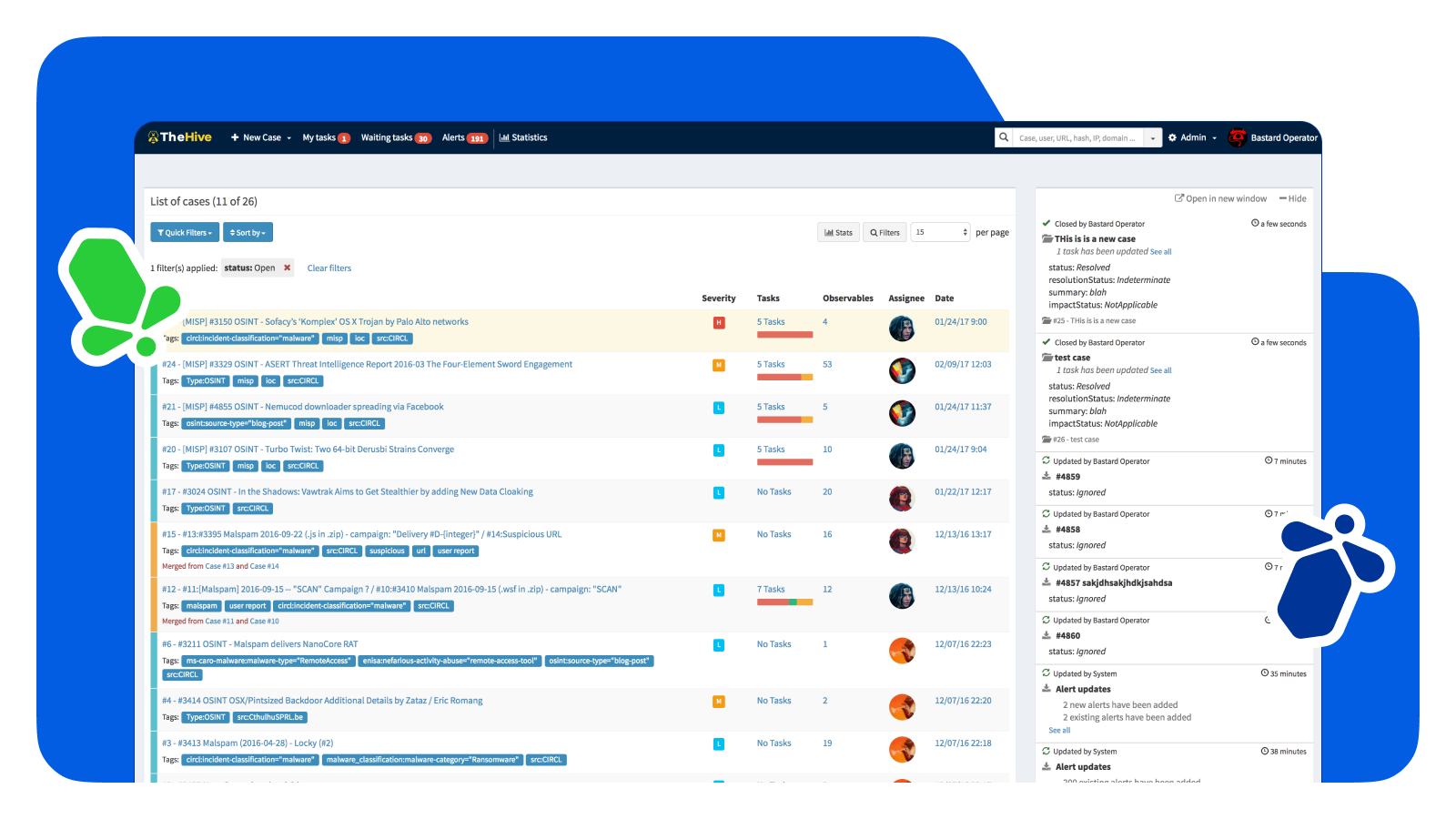
From that moment, Nabil, Jérôme and Thomas kept scaling TheHive. Their priority was to make sure it always matched the community’s requirements. At some point, thousands of cybersecurity teams worldwide were using this software. It became evident that they needed not only new features but also dedicated assistance and additional services.
So, in 2018, the three co-creators of TheHive founded StrangeBee to better support their customers.
Why “strange”? Why a “bee”?
The cybersecurity industry is dominated by serious, dark and intimidating brands. At the same time, incident response management can be frenetic, time is key, and analysts fight daily with phenomena like “alert fatigue.”
This is why, from the start, we aimed to create a brand radiating positive, cheerful vibes. We wanted to be "strange" compared to the prevailing market offerings. It was important that our customers love interacting with us and that our products bring them joy.
Also, one of our pillars has always been collaboration. We created TheHive with this in mind—to enable security analysts:
- to work together like bees in a real hive,
- to reach incident resolutions in the most efficient way,
- to share knowledge about cases with each other or with broader communities.
All this combined, when it was time to start the company, the co-founders instantly knew how to name it!
Into the future, preserving our DNA
By creating something new, we didn’t want to disrupt what we had already built. As we always strive for excellence, we wished to make it even better. For years, security analysts worldwide had associated StrangeBee, TheHive and Cortex with the previous visual identity. Therefore, we looked for something that would be an organic continuation of what had already become a symbol of trust for our users.
Let us finally introduce you to the results of months of research, brainstorming, collaboration and creative process, masterfully assisted by the Amprise Design studio.
What follows is an overview of the most essential things our new identity conveys. We’ll talk about all the details behind their choice in another article soon!
Overall style
We believe that a good product doesn’t need lots of decorations. So, simplicity and clarity were always at the heart of our visuals. We prefer not to show too many elements on one screen—just enough to empower our communication.
For the new visual identity, we’ve preserved these principles. We picked our two primary colors—blue and yellow—and made them brighter, adding more contrast to highlight what matters.
You can also see little flying bees now accompanying our content, symbolizing the synergy of our working together. They remind of the bee-like collaboration between StrangeBee and its community, as well as between TheHive’s users. They are also a colorful metaphor for diversity, which we deem an essential quality of any team, anywhere.
Logos
As the key visual differentiators of our company and products, we wanted our new logos to be connected to the “bee” concept. Plus, they were to be easily recognizable among competitors.
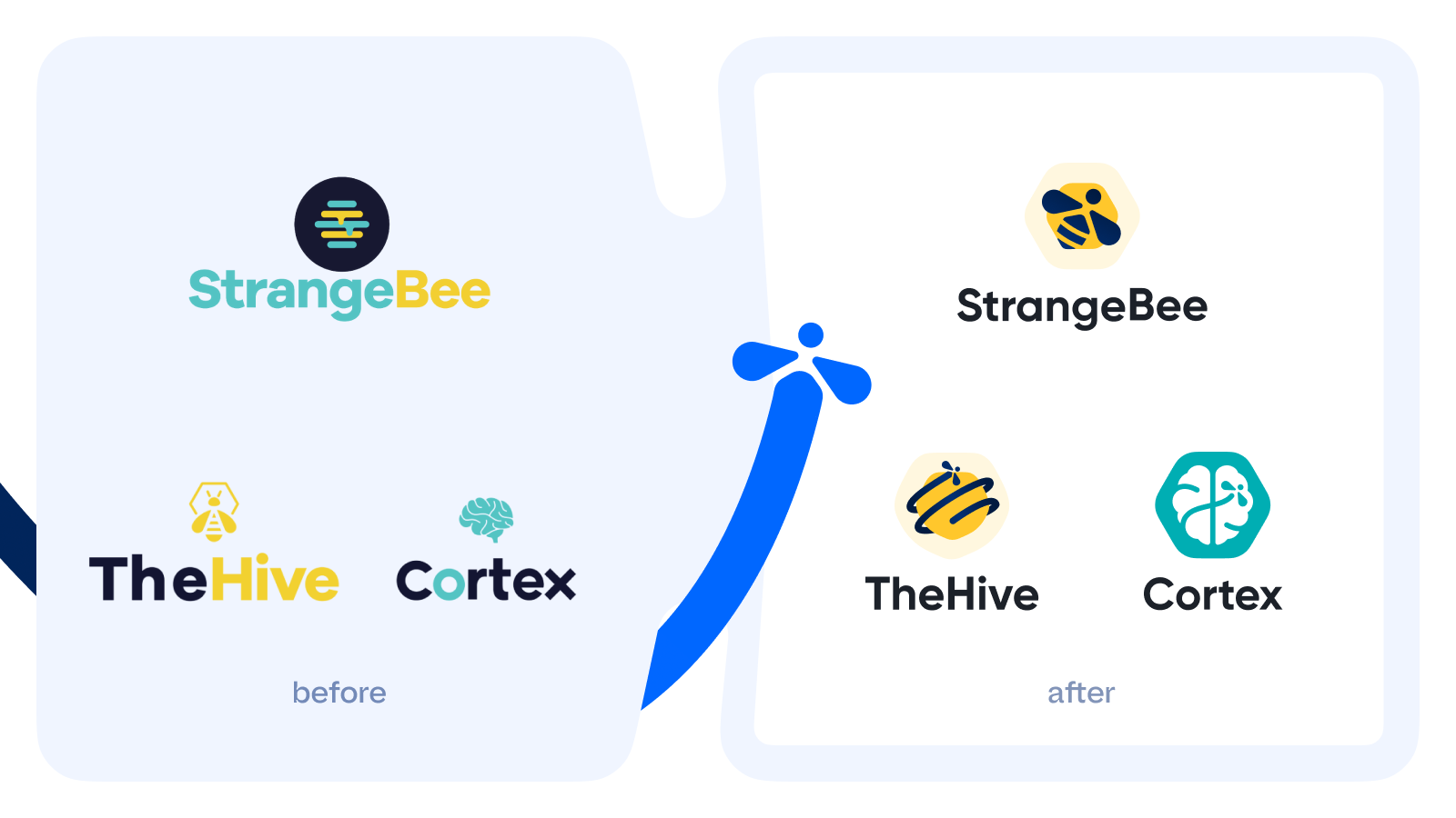
We wanted the logos to look great while being iconic. So, we made them quite minimalistic, flat, yet colorful. All three of them are now interconnected not only by style but also by the key element—a bee. This bee is in full flight everywhere, which makes the logos dynamic.
Also, as you can see, the previous logo of StrangeBee was a hive, and the logo of TheHive was a bee. The reason for this was that TheHive was born first—and the iconic bee was assigned to it.
When the company was founded in 2018, it got the logo of a hive, which allowed us to differentiate it visually from its core product but still keep them thematically connected.
Now, everything is in place.

Website interface
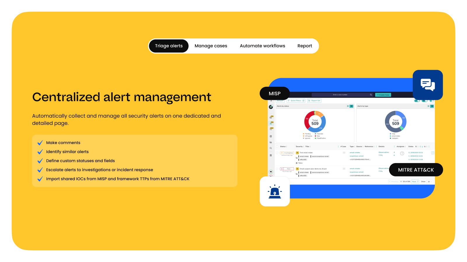
As StrangeBee is a company founded by security experts, we know the price of time in a fellow analyst’s life. This is why we tried to make the updated website straightforward and precise. We’ve invested a lot of effort in making the new content as well-structured, well-illustrated and relevant as possible.
It is our strong belief that one first needs to see the “inside” of a product to choose it later for their tasks. This is especially important for cybersecurity professionals, as even a slight interface inconvenience may worsen user experience and lead to missed incidents.
Tone of voice & messaging
The way we communicate with our community—human, sincere and honest—hasn’t changed since the very beginning of our story 10 years ago, and we’d like it to stay like this.
“Empowering Incident Responders Worldwide,” the old company slogan, did not change because nothing has changed here. The heart of StrangeBee is the same. We keep developing dedicated, powerful software for our colleagues—and we’re proud of it.
Speaking about our software: we have strengthened TheHive’s case management capabilities over time. We stay in direct and sustained contact with our users, so that our development team may implement the features necessary to keep up with the evolution of analysts’ jobs.
For this reason, we’ve decided to better highlight its main strengths and name it the Collaborative Security Case Management Platform.
Conclusion
The reimagined brand identity of StrangeBee reflects the company’s growth and evolution. It is a beautiful result of key principles we value in our work—integrity, initiative, excellence and most of all, collaborative spirit.
“Our story would not be possible without those who believe in us and trust us—thanks to our global community for being a part of it! We look forward to continuing to serve and support you with the same passion and dedication that has always defined StrangeBee,” shares Nabil Adouani, the CEO.
And now, enough words: dive into the vibrant world of the new StrangeBee and join us on this exciting journey!
