What’s behind the bee-autiful new logos of StrangeBee
Learn how we came up with the new symbols of StrangeBee, TheHive and Cortex

As you may have noticed, StrangeBee now has a totally new visual identity. We’ve already painted the big picture about the creative choices behind it.
Now it’s time to tell you about our company's updated “business cards” and products—their logos. Buckle up, and let’s go!
Starting points
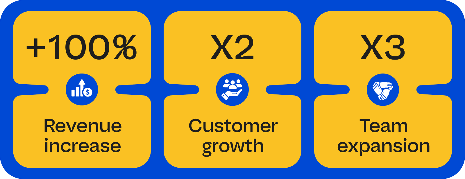
Last year, StrangeBee doubled its revenues and customer base and tripled its team. These results are even more significant, considering that our company is 100% bootstrapped and all our growth is purely organic.
StrangeBee entered a new era, strengthening its position in the market more than ever.
The old visual identity was originally created by our founders at the early stages of TheHive and StrangeBee. We have gone through a lot with it, but the company is growing fast, and we strive to improve our products every day. This effort towards excellence had to be reflected in our brand.
So, it was time for a rebranding.
We started by choosing a design agency and partnered with the amazing Amprise Design team. This studio became a trusted companion in finding and implementing our new style.
Waymarks
After a lot of research, brainstorming and iterations, we landed on the main ideas behind our direction for rebranding.
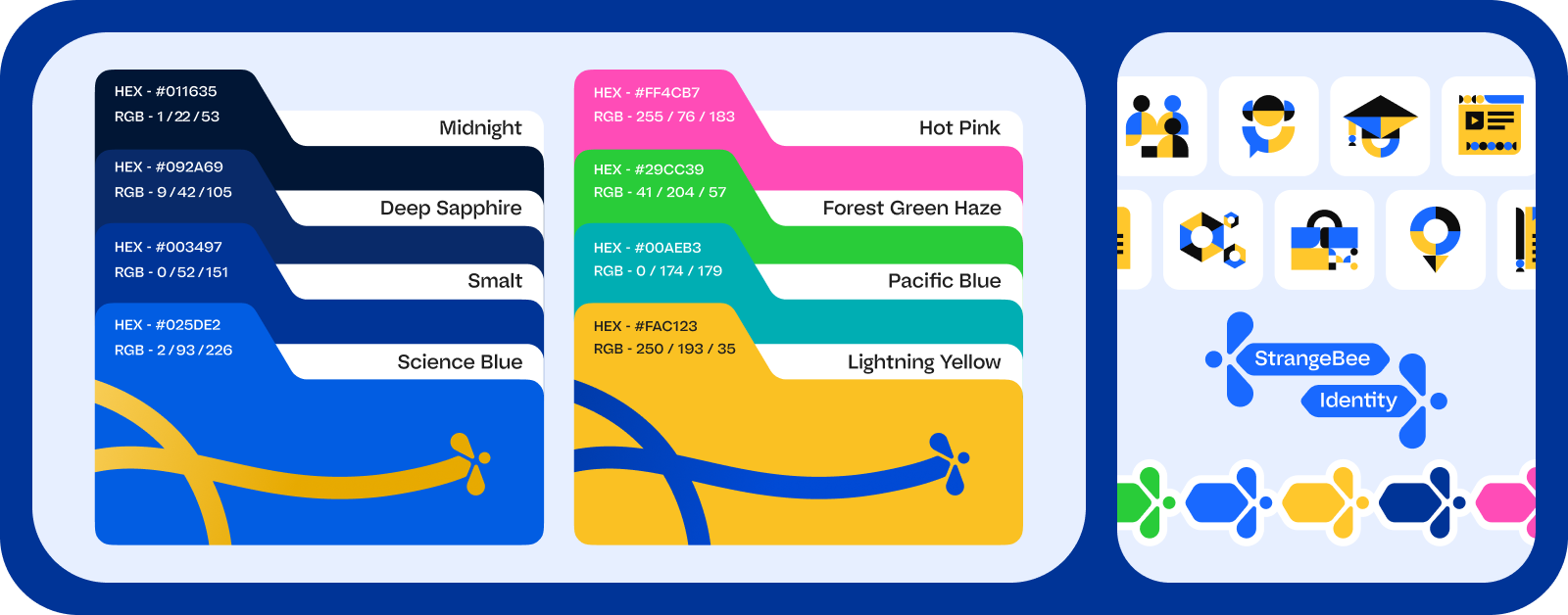
We wanted to create a welcoming and warm experience for our audience, as we’ve always prided ourselves on collaboration and aiming to make the lives of our fellow analysts easier. This is why we switched to bright, energetic colors and simpler lines so that together, all our new visual identity elements feel optimistic and reliable.
From the brand perspective, preserving the hexagonal shapes we'd always used in our designs was also important: they are the key shapes any hive is associated with.
With Amprise Design, we brainstormed about making metaphors for shields from our iconic hexagons. This way, the goal was to highlight the cybersecurity affiliation of our products.
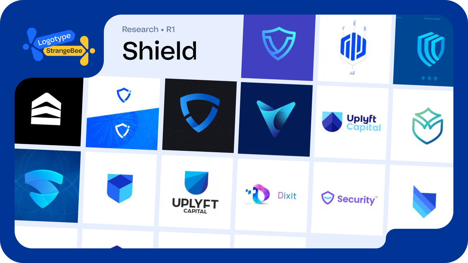
However, after input from our in-house product designers, this option was declined because it was too generic. TheHive is not just a cybersecurity solution; it's a platform created by incident responders for incident responders—this has allowed it to become trusted by the worldwide community.
So, we've emphasized the power of community and collaboration, choosing unique shapes and friendly, dynamic colors that reflect who we are.
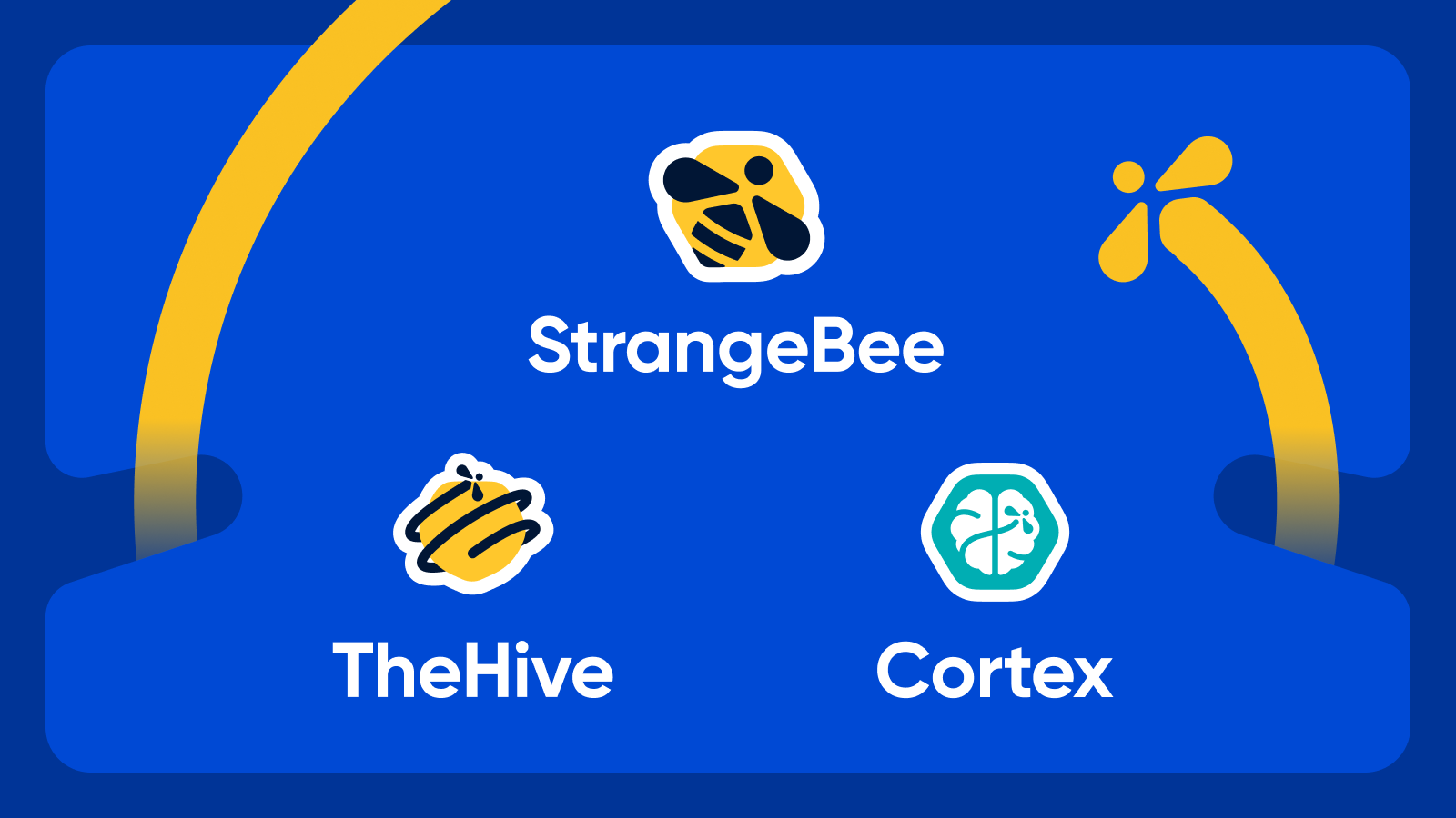
New bee for StrangeBee
We have used our company's previous logo for six years. It was great but not entirely logical, being a hive icon for an enterprise called StrangeBee.
When the founders initially created it, there was no other choice. The bee icon was already assigned to TheHive, yet they needed to keep both the company’s and the product’s logos thematically connected.
So, we took the current rebranding as the chance to put everything in its rightful place. Now, the “strange” bee of StrangeBee is the core element that inspires all the other ones in the new identity. A leitmotif that keeps our logos connected.
New hive for TheHive
TheHive’s old logo has served us for ten years and has become a worldwide-known symbol of our Security Case Management Platform. Even after we replaced StrangeBee’s hive logo with a bee-related one, we could not afford to change our key product’s identity so radically as to delete the iconic flying bee from it.
Instead, we gave it a new pair of wings—literally: it is now flying around a hive cell, symbolizing its goal to serve security “hives” around the world and promote a collaborative approach in incident response management.
New brain for Cortex
Cortex is named after an anatomical term that means (among other definitions) the outer layer of the brain—i.e., the container of knowledge and all the body’s nervous reactions. In our case, “knowledge” means analyzers that help investigate alert observables, and “nervous reactions” mean triggering incident responses.
So, voilà—the product’s new logo highlights its direct connection to TheHive (see the flying bee?) while still capturing the metaphor behind our powerful engine.
What’s in store?
The new visual identity has been designed with marketing and product needs in mind to ensure brand consistency. TheHive and its users are the heart of StrangeBee, and we always care about them, whatever we do.
We’ve already updated our whole website. Inside TheHive’s interface, users can notice the new logos being featured everywhere.
Any makeover is about more than external changes—it always reflects what’s happening inside. This is also true for StrangeBee.
This rebranding marks a new step in the company’s development. It’s rapidly growing—and the way it communicates with the world should evolve, too, becoming more cohesive and consistent with our positioning.
We are proud of our products and how many cybersecurity teams worldwide have trusted them for over a decade. With the energy of StrangeBee’s new visual identity, we aspire to strengthen our connection with the community, and we are always prepared to go the extra mile to ensure they receive the quality they deserve.
Be the first to learn our news! Join us on social media: